Most organizations that come to us know something isn’t working. They just can’t put their finger on what.
Their team has been patching things — moving a link here, changing a color there, making calls on the fly based on whoever had the loudest opinion that week. Nothing is backed by research. Nothing is thought out. It’s the scotch tape method, and it works until it really doesn’t.
I know within the first few minutes of using a site. There’s no logical flow. Pages don’t connect the way a real user would expect them to. Basic best practices have been skipped, not out of laziness, but because no one on the team knew to look for them.
That’s not a content problem or a visual design problem. That’s a UX Design maturity problem.
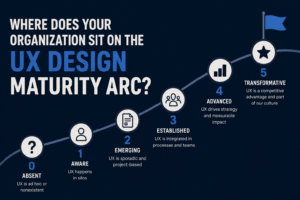
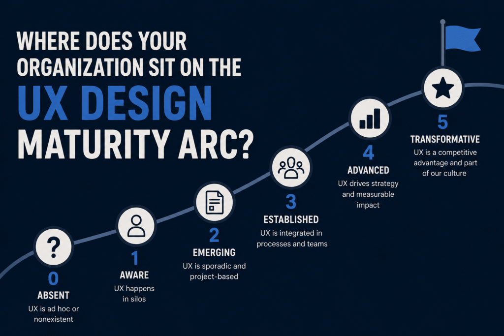
So What Is UX Design Maturity, Anyway?
It’s not about having a beautiful homepage. Any agency can make something look good.
UX maturity is about how deeply user experience thinking shapes your decisions — from the first planning conversation all the way through to launch and beyond. It shows up in whether your navigation makes sense to a first-time visitor. Whether your pages connect logically. Whether the people who actually use your site can find what they came for.
High-maturity organizations build with the user in mind at every stage. Low-maturity organizations build for themselves — for internal stakeholders, internal processes, internal politics.
The Maturity Stepping Stones at a Glance
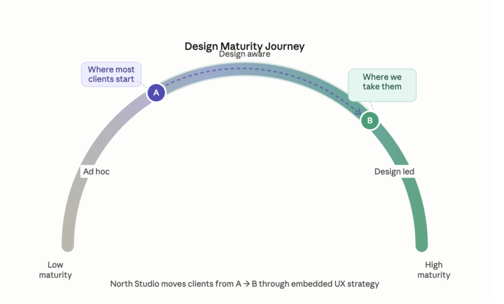
Most of our clients arrive somewhere between level 2 and level 4. They leave operating at a 5.
Where Most Organizations Land
After years of doing this work, the patterns are pretty predictable.
Large organizations and higher education are our sweet spot at North Studio— and honestly, their sites are often internal org charts with a logo on top. Teams are lean. Budgets are stretched. Decisions get made by committee. The site ends up reflecting the org structure instead of the user’s needs.
Smaller nonprofits and early-stage organizations are usually just trying to get something live and functional. Deep UX strategy isn’t the priority yet, and that’s okay. Not every organization needs to be at the highest level of maturity. They need to be at the level that makes sense for where they are right now.
The organizations that struggle most are the ones stuck in the middle. They are big enough to have a complex site, but without a dedicated UX strategy to back it up. That’s where the scotch tape method really starts to show! That’s what I like to call it.
Why Drupal Organizations Feel This the Most
Drupal attracts serious organizations — universities, government agencies, nonprofits, healthcare systems. Big content. Complex needs. High expectations.
And all of that complexity pulls attention away from UX. The focus goes to content architecture, compliance, backend integrations, and technical performance. Usability and user flow get pushed to the back burner, not because they don’t matter, but because there are only so many hours and so many dollars.
The result is a powerful platform that frustrates the very people it was built for.
We’ve worked with organizations in exactly this situation — Kentucky Legal Aid, ISPE, Marietta College, The Triangle Group. In every case, bringing UX in early was the difference between a site that functions and one that actually performs.
The Mistake Most Organizations Make
They think UX is a quick fix. Change the button color. Rewrite the headline. Move the nav link. Done. However, there is often an iceberg of problems underneath.
But every change made without a strategy just opens up new problems somewhere else. You end up chasing your own tail, patching things in isolation, creating new confusion downstream, and never actually solving the underlying issue.
The organizations winning online like Amazon, Apple, Google, Target aren’t debating whether UX matters. That debate is long over. They’ve built massive teams around it. Our clients don’t need that. But they do need to stop making decisions based on personal opinion and start making them based on how users actually behave.
That shift is what separates a site that looks fine from a site that actually works.
What That Looks Like in Practice
Moving the marker doesn’t mean rebuilding everything at once. It means being strategic about where you start.
- Talk to real users before making decisions — not guessing based on internal assumptions
- Run alignment workshops with your team before a single wireframe gets drawn — teams are rarely as aligned as they think they are
- Watch real people use the site — and listen when they get confused instead of explaining why they shouldn’t be
- Do competitive analysis — understand what’s working elsewhere before reinventing the wheel
- Integrate content strategy and UX together — not handing off copy after the designs are already done
- Ground decisions in evidence — we reference Nielsen Norman Group and Baymard Institute because standards exist for a reason
- Follow the data — track where users go, what they click, and where they leave
What Working with North Studio Gets You
When UX is part of the process from the start, the results show up in real ways:
- Fewer support requests
- Better content discoverability
- Higher form completion rates
- Stronger user engagement
- Less stakeholder conflict — because decisions are based on user data, not internal opinions
What Moving the Marker Actually Looks Like
It’s not a full redesign. It’s not a perfectly polished site overnight.
We start with your highest priority pages, the ones doing the most work, losing the most people. We fix the flow, tighten the logic, and ground every decision in what users actually do. Secondary pages come later. You move the marker, not the whole field.
That’s how design maturity gets built. Not all at once — but with intention, in the right order, with someone who’s seen these patterns enough times to know exactly where to start.
The Takeaway
Design maturity isn’t a finish line. It’s something you build over time — with the right partner.
North Studio isn’t here for one-off projects. We meet you where you are on the arc and build toward what’s next — with intention, with evidence, and with the user at the center of every decision.
Ready to find out where your organization sits — and what it would take to move the marker? Let’s talk.